
Maxwell Growth app
E-learning growth app
Maxwell Growth App is a mobile e-learning platform designed to support personal and professional development through courses in communication, leadership, mindset, innovation and more. I led UX and product design working closely with the Maxwell Leadership team to create a clean, intuitive mobile experience that supports learning on-the-go and accelerates skill growth.
Client
Maxwell Leadership
Services
Visual Design UI & UX Design
Industries
E-learning and Coaching
Date
May 2024
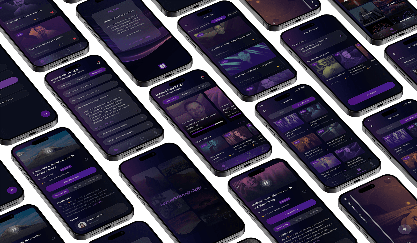
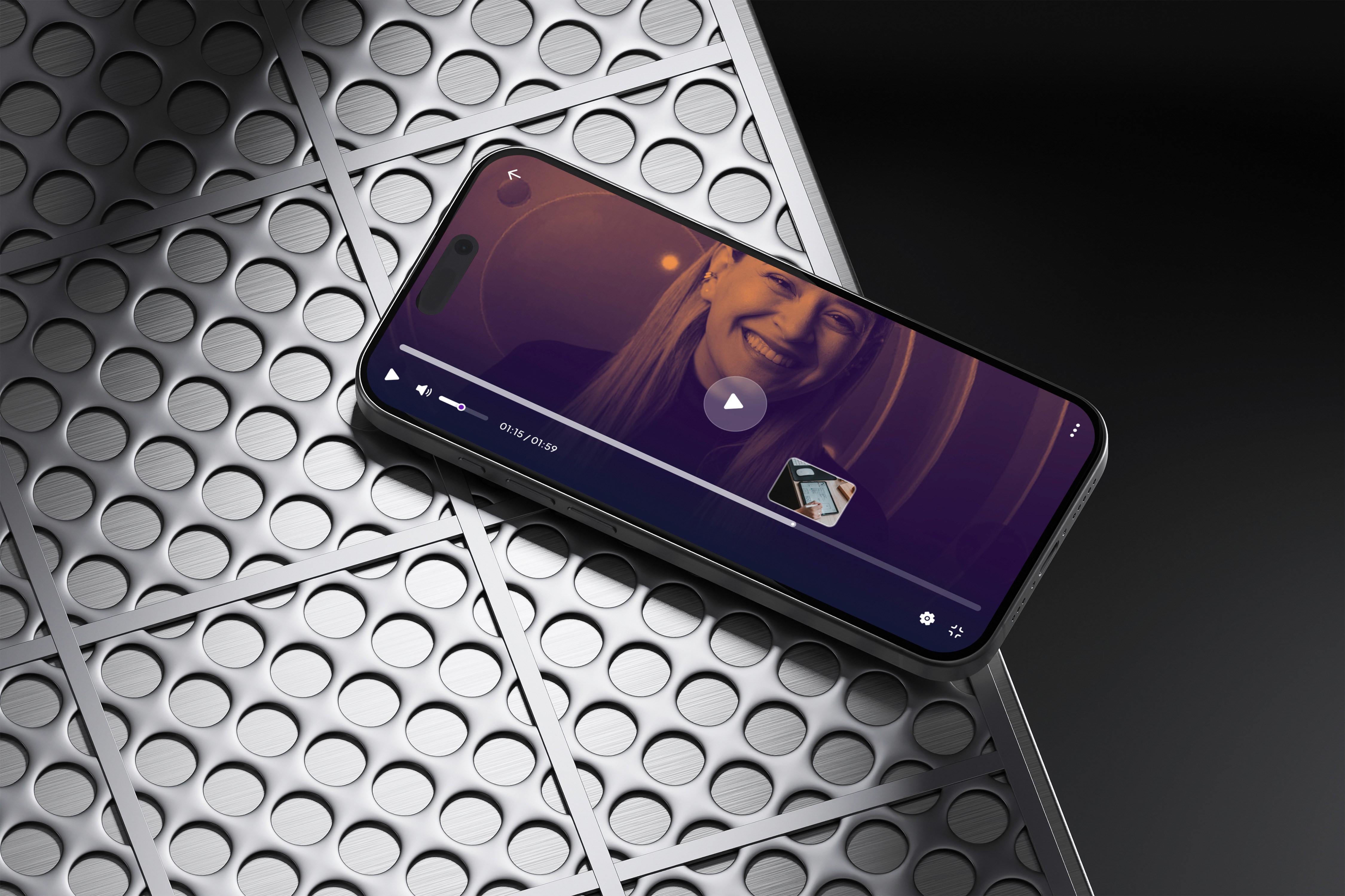
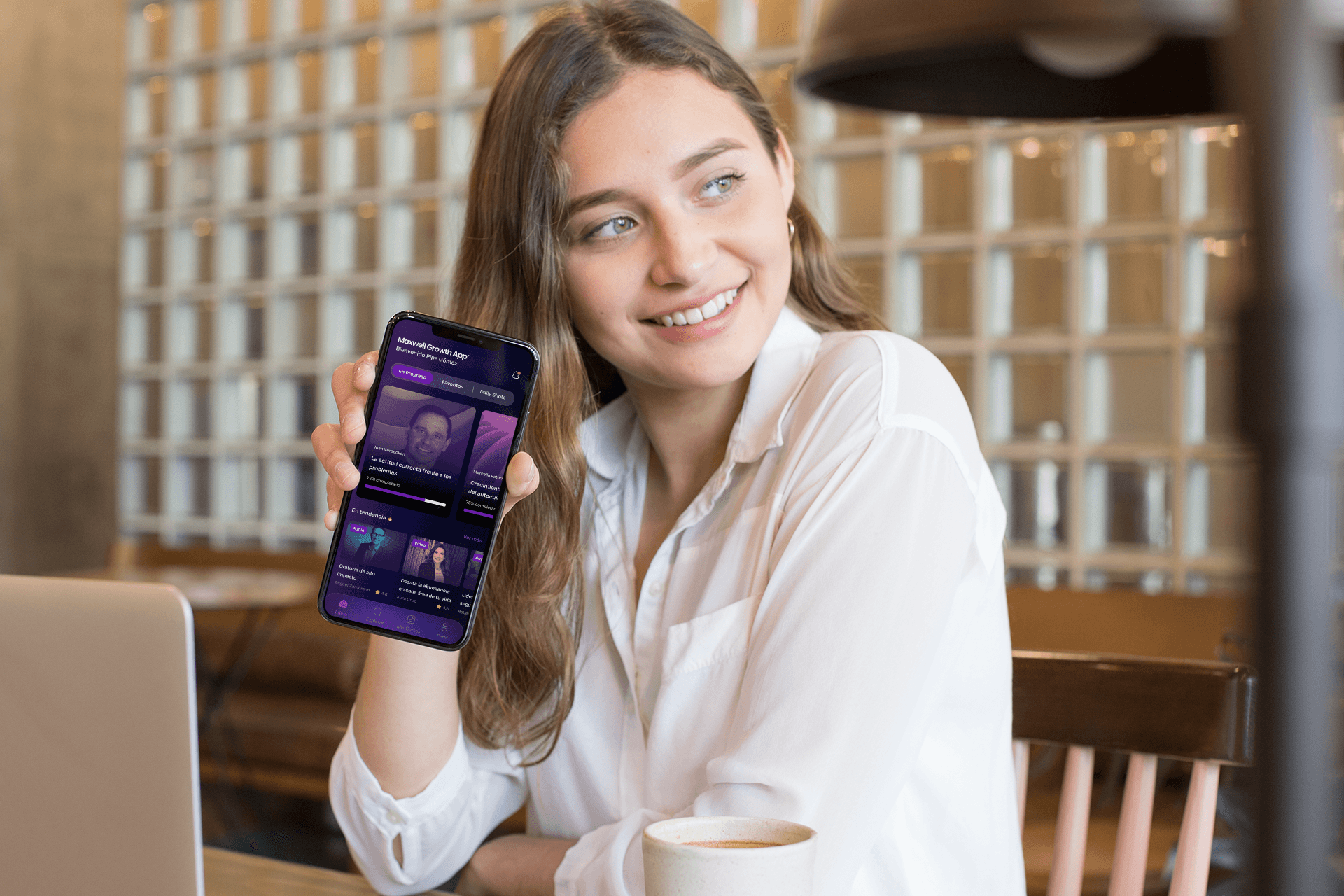
Project summary Maxwell Growth App was built to help users access high-quality educational content anytime, anywhere. My role was to understand how mobile learners engage with educational tools, streamline their journey from onboarding to course completion, and craft interfaces and interactions that reduce friction and increase engagement. This mobile app serves learners with video and audio courses, certificates that users can share on social media, and a system that encourages continued growth and exploration.  The problem we set out to solve Mobile learners often abandon educational apps due to confusion during onboarding, unclear navigation, or lack of motivation to continue engaging with content. The Maxwell team wanted an experience that was not only aesthetically pleasing, but also intuitive, motivating, and aligned with real user expectations for mobile learning. This meant creating flows that welcomed learners, made content easy to discover, and encouraged completion of courses and certifications.  Team collaboration This was a highly collaborative project where communication and alignment were central to success: I was the only designer working within a cross-functional partnership that included product leadership and internal subject matter experts from Maxwell’s educational team. We established clear weekly check-ins and asynchronous feedback loops to ensure design decisions were transparent and understood across the team. Weekly design reviews and Loom walkthroughs helped me gather feedback from stakeholders and internal QA testers. Collaboration was intentionally structured so that insights from both instructional advisors and internal teams informed design iterations at every stage.  What I focused on From the beginning, I mapped the key user journeys for onboarding, course discovery, learning sessions, and certification. I translated these journeys into low-fidelity wireframes that allowed rapid alignment on structure and hierarchy. These wireframes became the foundation for interactive prototypes that were tested internally, surfacing navigation issues and content clarity challenges early in the process. Once core flows were validated, I delivered a clean and accessible UI that felt consistent across Android and iOS devices. In addition to visual polish, I crafted all microcopy within the app to improve clarity, motivation and flow.  Design decisions that drove impact One of the key choices was to simplify onboarding by focusing users immediately on value — making it easy to sign up, begin a course, and understand what progress looks like. This helped avoid cognitive overload early in the experience. I also structured course discovery so learners could quickly find relevant content without unnecessary clicks. Prioritizing clear visual cues and task-oriented flow reduced confusion and increased engagement through the first core tasks. Another impactful decision was to emphasize shareable certificates and social proof, encouraging users to proudly display their achievements and potentially drive community growth.
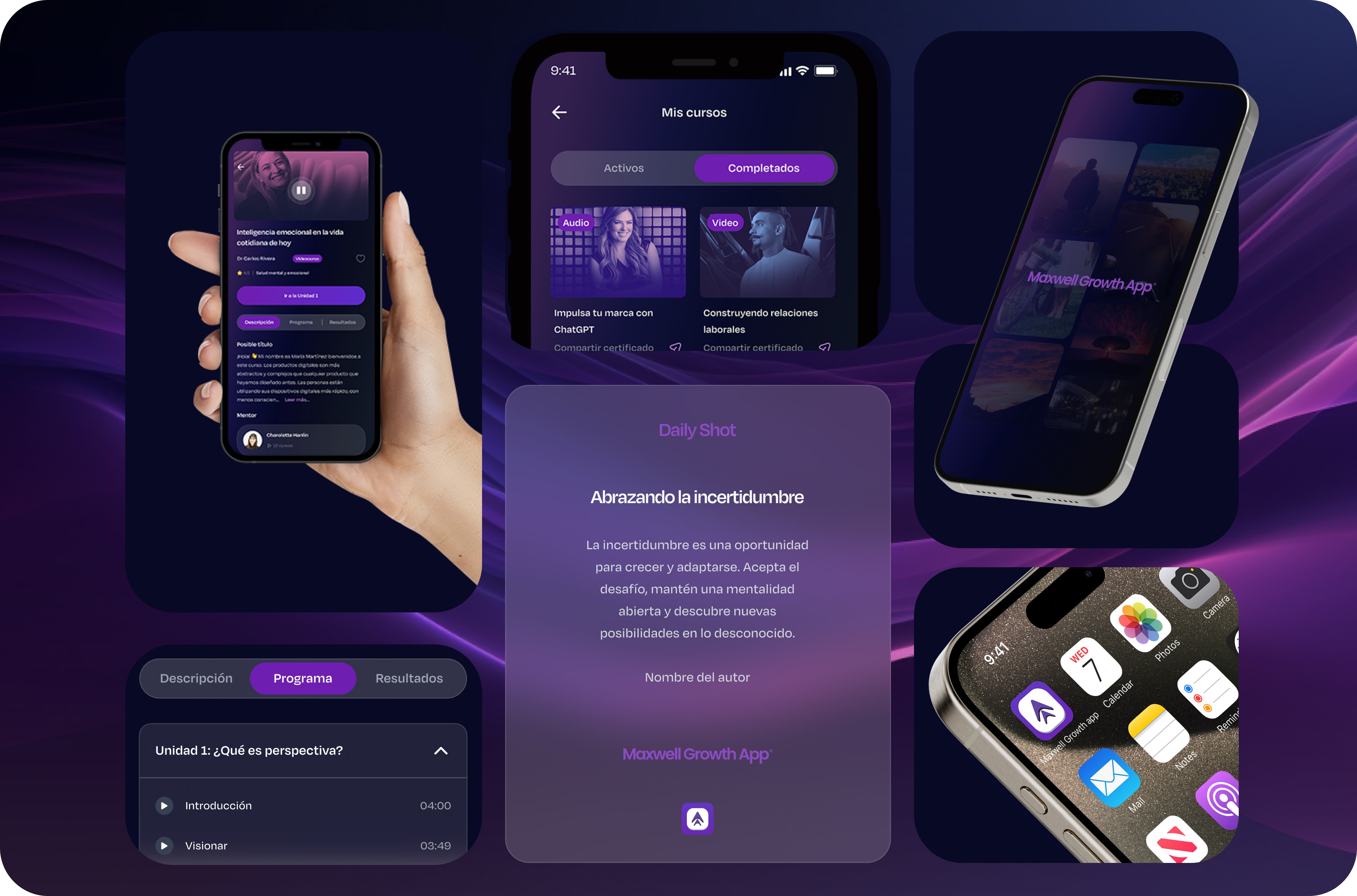

How we validated our work We measured and refined based on internal feedback and proxy usage indicators during the first stages post-launch: • Onboarding completion increased by approximately 35 % within the first month after launch, suggesting learners could begin engaging with content more smoothly.  • Confusion around navigation dropped by around 40 % based on internal support and feedback logs, indicating users were less stuck and more productive.  • Engagement with course sharing and certification features increased by approximately 25 %, hinting at stronger motivation and pride in accomplishments.  • Average time to start a course after onboarding improved by about 18 %, showing better flow continuity.  These early indicators underline how thoughtful UX design can increase clarity and efficiency in mobile learning apps, even without large-scale analytics initially. Scholarly insights in e-learning UX support that user-centered design, clarity and motivation mechanics are critical for sustainable engagement.  Results and outcomes The app now offers a robust, mobile-first educational experience where users can explore a wide range of courses at their own pace, supported by an intuitive and motivating design. By improving usability and streamlining core interactions, the Maxwell Growth App became a trusted learning companion for users seeking personal and professional growth. The optimized onboarding and discovery experience sets the stage for long-term engagement and supports future enhancements like adaptive learning paths or personalized recommendations based on progress and interests. What we learned This project reiterated the importance of meeting mobile learners where they are. Reducing friction in key flows, using clear and motivating language, and grounding decisions in real feedback helps learners stay engaged and confident. I also learned that designing for educational outcomes requires a balance between clarity, motivation and accessibility, especially on smaller screens and on-the-go contexts. Looking forward With the foundation in place, continued improvements could include deeper personalization using behavioral data, adaptive learning recommendations, gamification elements to boost engagement, and richer analytics to better understand long-term retention patterns.