Raffle app, personal project
Fast and easy way to create raffles
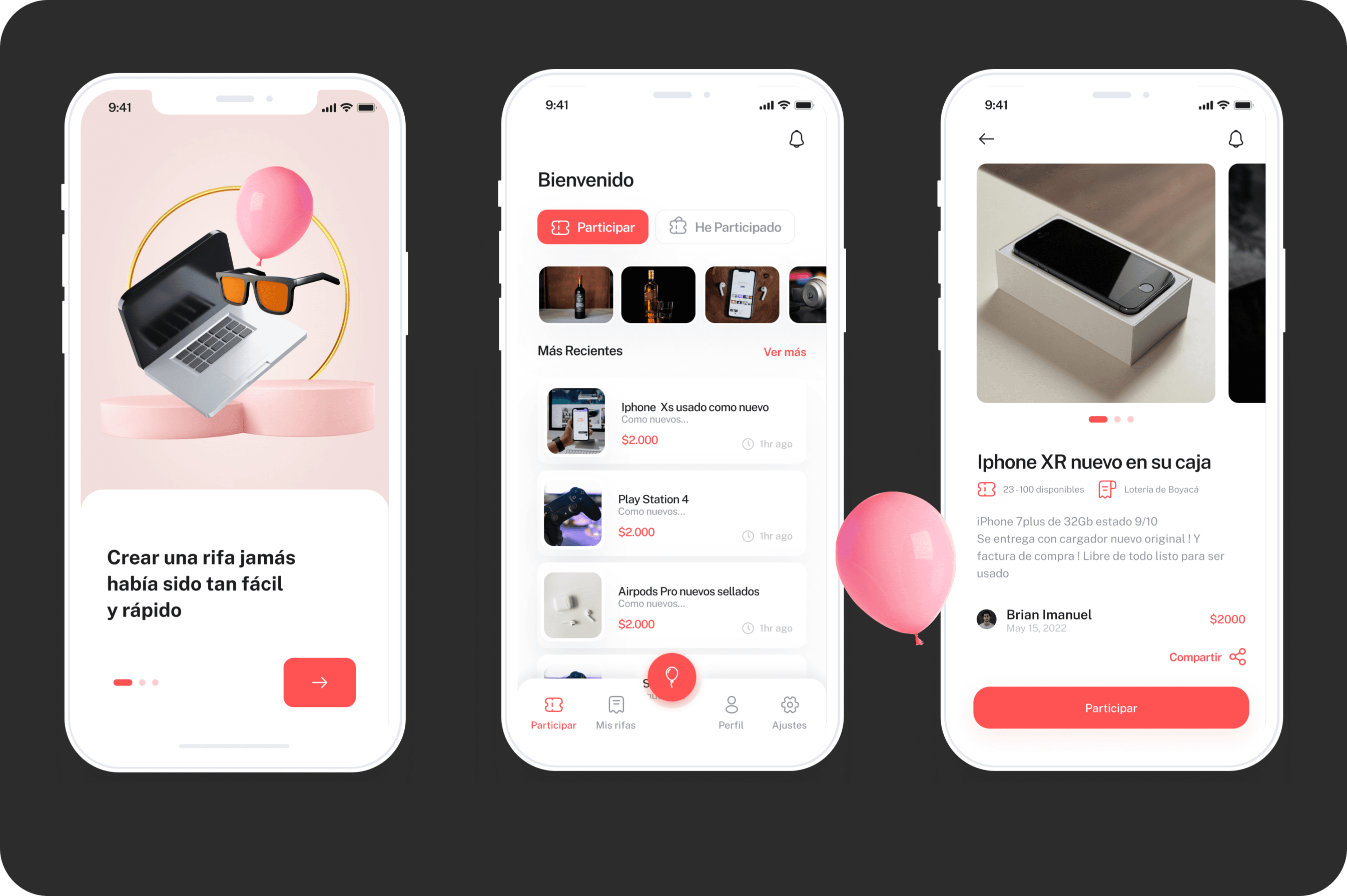
Rifapp was born from the need to modernize the way raffles are created and managed, especially in informal markets where raffles are still often done using pen, paper, and spreadsheets. This MVP lets users quickly create their own raffles, sell numbers securely, and also participate in raffles organized by others, all in one place. The idea was to bring transparency, convenience, and professionalism to a widely popular activity that lacked proper digital tools
Client
Rifapp
Services
Visual Design UI & UX Design
Industries
Gambling, Gaming and Entertainment
Date
October 2022
Project summary Raffles are a popular mechanism for fundraising, events, and community engagement, but many organizers still manage them using manual processes that are time-consuming and prone to error. Rifapp aimed to bring transparency, convenience, and efficiency to digital raffles by providing features that let users create raffles quickly, sell numbers securely, track outcomes and share results—all from a browser interface that works well on mobile devices.  The problem we set out to solve In many informal and community-driven markets, raffles are organized without purpose-built tools, relying instead on pen, paper, spreadsheets, or manual tracking. This leads to confusion, lack of transparency around ticket availability, and inefficiencies in payment reconciliation and result tracking. Rifapp was designed to solve these challenges by offering a digital experience that was simple to use, clear in communication, and fast in execution.  Team collaboration As the sole product designer on Rifapp, I worked closely with stakeholders and early adopters to validate assumptions and iterated rapidly based on their feedback. I coordinated research insights with engineering feasibility considerations and remained closely aligned with product expectations throughout the prototyping and design execution phases. This cross-disciplinary feedback loop ensured that design decisions were both user-centered and technically grounded.  What I focused on My approach began with identifying the core pain points for both raffle organizers and participants. I conducted informal interviews and contextual observations to understand how raffles were run in real situations and where friction occurred. Using these insights, I mapped key user journeys such as setting up a raffle, selecting and reserving numbers, tracking sales, and checking results. ﹘Wireframes allowed us to validate flows early, surface friction points, and refine logic before moving into high-fidelity design.  In parallel, I developed a design system with scalable UI components that could be reused across responsive breakpoints and future native implementations. Typography, spacing, visual hierarchy, and microcopy were all optimized for clarity and usability on mobile screens.  Design decisions that drove impact One of the key challenges was number selection for raffles, especially for events with hundreds or even thousands of tickets. Traditional patterns like dropdowns and carousels did not scale well. To address this, I designed a responsive grid with real-time availability indicators and dynamic feedback so users could see which numbers were available, reserved, or sold at a glance. This helped reduce cognitive load and increased confidence during ticket selection.  I also prioritized a mobile-first flow for creating and managing raffles, recognizing that most users would access the platform through their phones. Clear call-to-actions, concise labeling, and progressive disclosure of information helped users complete tasks with fewer steps and less hesitation. 
How we validated our work Even at the MVP stage, we were able to test key interactions with early users and gather qualitative feedback to iterate rapidly: • Early usability feedback indicated that users could set up a new raffle in under half the time compared to traditional manual processes, suggesting increased efficiency and confidence with the interface.  • Number selection decision time dropped by more than 40 % compared to paper workflows, showing reduced friction in one of the most complex interactions.  • Organizers expressed stronger trust in the visibility of ticket availability and results tracking than they had with spreadsheets or paper tabs.  These early indicators show the value of translating real-world pain points into design solutions that are efficient, transparent, and easy to use—especially in contexts where digital tools are replacing manual operations.  Results and outcomes Rifapp’s MVP provided a clear and scalable foundation for raffle creation and participation. The responsive grid component for ticket selection significantly reduced decision complexity for users and set a baseline interaction pattern that can be extended into native mobile versions. The design system also established a consistent visual language that will support future growth.  Organizers reported increased confidence and perceived fairness in the process, and early testing showed that workflows were both faster and clearer compared to manual methods. This laid the groundwork for enhancing payment integrations and onboarding marketing efforts tailored to small businesses and community organizers.  What we learned This project reinforced that simplicity and clarity in mobile-oriented workflows are essential when replacing manual systems. Understanding user context in informal markets helped shape interactions that were both intuitive and reliable. Prioritizing a mobile-first experience and optimizing core flows for speed and clarity improved overall satisfaction and reduced frustration.  Looking forward With the MVP fully designed and ready for development, the next phase will involve expanding payment integration options, refining onboarding flows, and launching initial marketing to onboard organizers. In future iterations, advanced analytics and personalization could further increase engagement and trust in the platform. The MVP is fully designed and ready for development. It provides a strong foundation for a future native rollout and has already attracted early users interested in digitizing their raffle operations. Initial usability tests show that users feel more in control of their raffles, appreciate the transparency, and enjoy how quick it is to set things up. The number selection flow, in particular, reduced cognitive friction and decision time by more than 40% compared to paper-based workflows. Next steps include completing development, expanding payment integration options, and launching marketing efforts to onboard small business owners and raffle organizers.


